Chapter
8
.
Derivatives
Pre-Test Question:
Math and Graphing Review
true
true
You must read each slide, and complete any questions on the slide, in sequence.
Question
y5Vw7qcsrjwZ5IBP2PVBle5Qe950cWv6i+sMKFjtbAtocTCZsInSs7v/ZigGpHssa6V4HRFTQH+B8PYYxwWLSaFxhh7Jiofyx2NhL67bzoHKa1woYjKqi7N/9gb5vfthJfzmfzU1qpdPcxtu7EktGPDoLcNBAC3stBXKjfeU0SMiq7patev1wNiHcEajrOgKPMzVLy6LCwHi5zNhH/NX86ADIGfPtDbJ+yDsW+WybA6sN1KHCGocQNtStmL6snImgihyEUrkfc3Lithhk80rNF9imPioWUjp4NfCxDjcO869T9cgESuZTA==
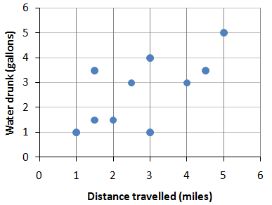
Correct! Each point represents a combination of distance travelled and water drunk.
Sorry, the correct answer is a scatterplot. Each point represents a combination of distance travelled and water drunk.
Video
Post-Test Questions:
Question
8.1
0WZGE7Nr3ICLHNw+Q+swt3qsQOCQdFtvDLz3NSWDTc5rQedJhKQSii/xVcDF+vZAY6OjyzSM1QyFXtvIngGtTCeTRlQAFVcle2yDcmJvUo53oNEcTdY5NJlf6VKmlooBQwW/YVZaHWU8qO5YpMHpwM5XDEcNbBVcAY3MR9bx51ZE/vjbdwwPko4aOeXCJFxLUKUq/uvnzn4SivCTIJvDjgTlohoJpCNmGZlB9EgEuJpQ0xF3UaOyOGqBwGq5W7y8pf927QK94ye9btwd/YKUBfbH4n0sQksSfZZXlQ6QEtdZxoEz
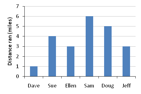
Correct! The graph compares the distance individuals ran using vertical bars that represent distance in miles.
Sorry, the correct answer is a bar graph. The graph compares the distance individuals ran using vertical bars that represent distance in miles.
Question
8.2
RBEAfM1lOh0+Ij9VULMUkxi6KtPZf3lW1KO/U1DMxHMhZFCawGnALGJjrHdJYpkO6eB/KKlaAfhbrdHE6h6EnTcV6sMYC8uYojjKqULKPB3eWjnx6vSYvyx5vF9bl9FvmJIRRWlMISrzvWhRf4hJ3/8P0fV4m0Jv/TACsSycfdBuc5+VGUWPRJi5soLqcnKzWAkrJMcW20KjCtebpOOMRqd3LROmGQjYCbGNenp36nCiv8rXnJbM9No4JilvJsUQgrokwDKvQdiIsSgGNaaC3reiNZ/z15HADaL7Tw==
Correct! A pie chart would be the best way to present the proportions of a whole.
Sorry, the correct answer is a pie chart. A pie chart is the best way to present the proportions of a whole.
Question
8.3
g6hZxvzFcJ88VtG3/LsBj2LZXIgjmTUjIpX+Z7MRI4zCHzCAeDAI5dKk5n7c9y+mdF2YpTOHMPngs4DjVkV5GkFebMUwkUVRCNdPD9URZh8HXTS+BZcHyKXokmWd9yX0o8CT22Mz6FyM+lLm9mlmtwsd4O0eraKUC2IyizUOXBReWYEG28bhrQW9qDUXe1PFKZepUM4s3/omqK/wtyPsk+TE4fl8npa05U/OWMvUQ0dMYxDhEJ+12azEST0ish7agQ6ODaUmsllTYGtahGfygoLyl/EI4x8egElNMMjymi69mNGtQ78P8i++q08=
Correct! A multiple line graph works best to compare multiple series over time on the same graph.
Sorry, the correct answer is a multiple line graph. A multiple line graph works best to compare multiple series over time on the same graph.
Question
8.4
7Of4CXuNuhCKmqXhM8RGexWwL7S5EoQyXCwxHGxIpyjy4A8mfuyFcHjmT/dKsxct4Oj1A00aOL4K2gQGuNY2SRuTN3ryOzQHvhOyKD87hhi82yvJgcBIAaENf1WNO6KkVY4usATLl7mHrnsuhl4MDS9fQf4MQbKfswQuKwNrZhoqfwiPgnvGm2qt8hYBTPeXYLJnY9ge3J51mfdMKHud8zhx29AGwGTAEhgOl/o5UN5YoID9CQtL948rdFs1yNSp9J/dzgIuL2J/4NB7DWIlNz8xk1hLMT62lmU5bVrGybpdFGJO
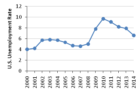
Correct! The graph shows a single series over time.
Sorry, the correct answer is a line graph. The graph shows a single series over time.
Question
8.5
BohLjX/lj5A3/XVMTWB92qme3dXAh30KDfYL6fFmi5S1Ij1bUOE0HK0aQ5z4+CPw417y14V6MzmHrWP84GwDgVYzQRrA+4mi3PJR547V1ZCmJ9vSLmR4mc6mSZuQUClaq+y+LJefI8/cFI93n1lfrARL+25MVvXAw4in6GDtSpXkh5eX5RzU9KYMv01CLrLB8Li3knv6f1ja6T/Nk2GAFRDdPOAjo77ifnjh2KCNmGAxNDU417r2n6G6GVxIz/s0moR3cTbiKzRb7r63
Correct! Each point in a scatterplot represents a combination of two variables, such as height and weight.
Sorry, the correct answer is a scatterplot. Each point in a scatterplot represents a combination of two variables, such as height and weight.